Tragic Design is…
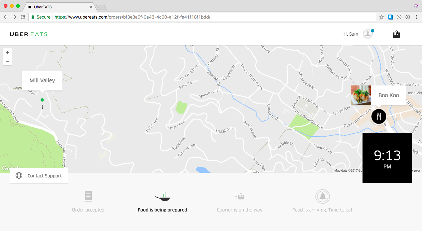
When an app lets you accidentally enter a zip code instead of a full address and still completes your order. Optimizing for click-throughs, I guess?
This was too boring for a tweet and now I want to find more examples. Then I made some tweets.
The following was adapted using Darius Kazemi’s wonderful new alternative to twitter moments™, spooler.
A thread by very un-dude (that’s me)
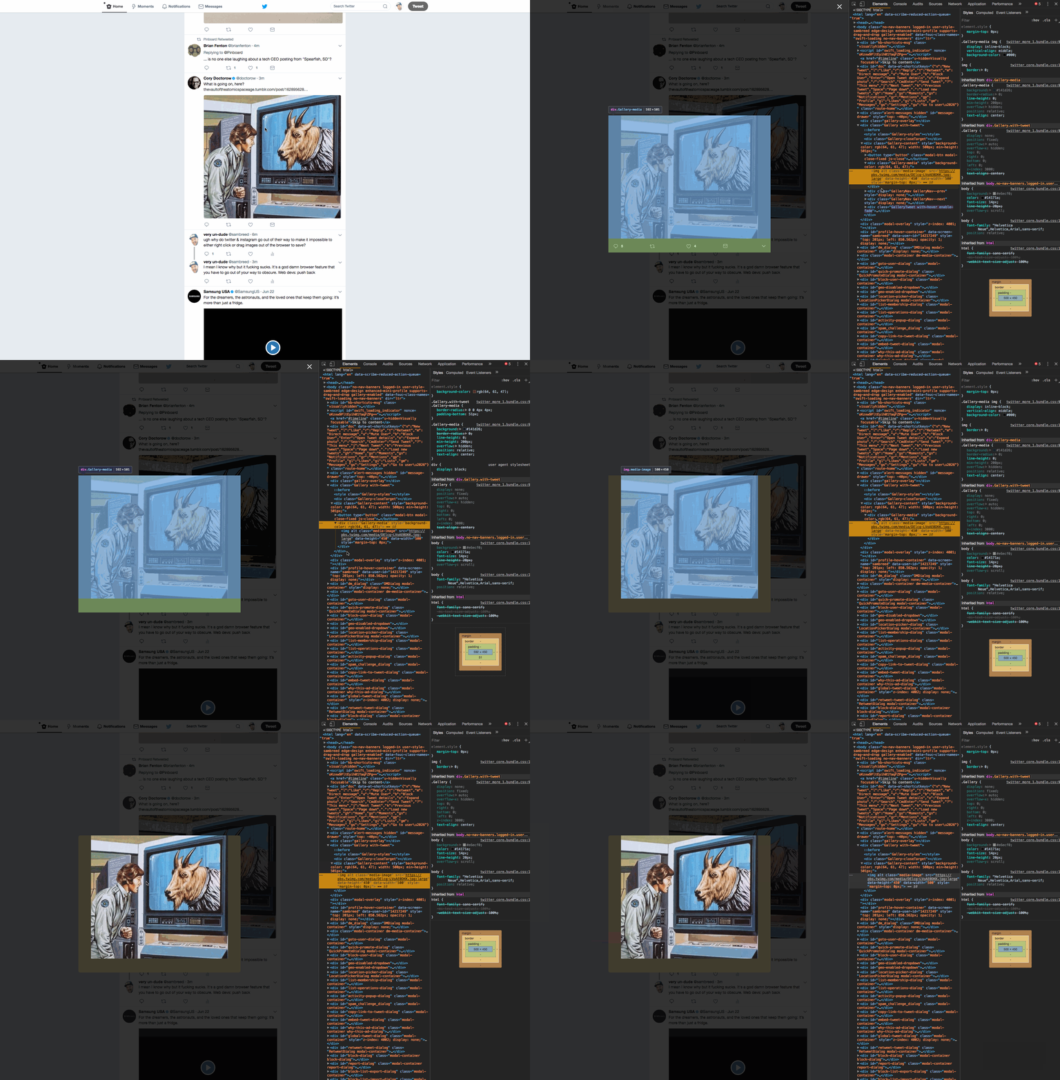
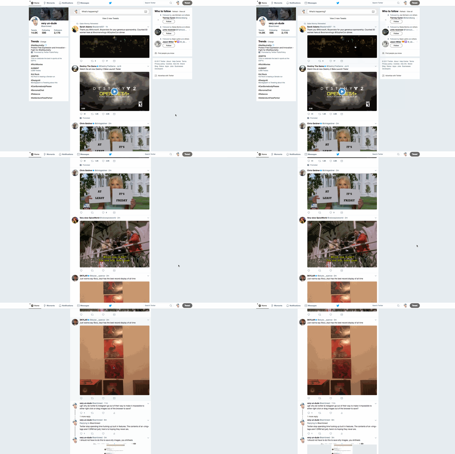
Why do twitter & instagram go out of their way to make it impossible to either right click or drag images out of the browser to save? I mean I know why but it fucking sucks.[1] It’s a god damn browser feature that you have to go out of your way to obscure. Web devs: push back![2]
Twitter stop spending time fucking up built in features. The contents of an <img> tags aren’t DRM’ed (yet), here’s to hoping they never are.[3] I should not have to do this to save silly images, you shitheels![4]
oh shit I made a dope new feature tho — that image is now every image. twitter, if you hire me I will gladly ruin this product with you…[5]
Why is this tragic?
In the case of Uber, it’s just stupid that it let me complete an order without confirming the address. The checkout flow on web seems to have changed since I recorded that screenshot.
For Twitter, this is a case of wanting to optimize sharing over saving and reposting. The only problem is that taints an essential underpinning of the world wide web: URIs are the lowest common denomonator of sharing. It’s excessively inefficient to embed media without having it hosted somewhere that you can identify with a publicly readable URI. Using DOM and CSS to try to prevent users from discovering the resource idenfiers for media you just served them is antithetical to building an open web. The irony is that Twitter is that it’s biggest redeeming quality is that it’s not an entirely closed walled garden, like Facebook or Snapchat. Working against a platform feature that’s a core property of something you benefit from seems doubly wasteful.
What is Tragic Design
For one, Tragic Design is a book by Jonathan Shariat & Cynthia Savard Saucier that made it’s way onto my 2017 Reading List. Go figure. It’s a clever title and describes an obvious-yet-undescribed idea: design that’s harmful to users can cause a disproportionate amount of trouble, beyond just looking bad. For all the talk about the human element being paramount in the thoughts of designers, it’s surprisingly easy for this to be the first thing that’s lost when software developers (or even worse, bureaucrats) get involved.
Footnotes


